
Add a patron feature to help creators monetize.
As a speculative project, I designed the beta for an Instagram feature which enables fans to contribute directly to their favorite creators via a “Support” button on their page.
Project background
TikTok poses an existential threat to Instagram. To keep pace–Instagram has been rushing to roll out new features to entice creators to invest in their platform (e.g. “Bonuses”, creators marketplace, subscriptions).
Problem
For creators, payment from “Bonuses”, the pay-per-play on IG Reels, tends to be meager–not enough to cover groceries, let alone live on. Instagram has only recently invested in a creator fund, but shares significantly less revenue than other competing platforms.
Currently, most creators earn their income via brand collaborations–creating paid content or earning commissions from affiliate links. The issue with sponsored content is it’s fickle–gigs can dry up suddenly, leaving creators in a financially precarious position. Furthermore, Instagram severely represses sponsored collaborations, harming creator metrics. Paid collabs also generally don’t create a lot of value for audiences–it results in non-advertising content and ads disappointingly blending together.
Goal
Research, design and test a solution to financially support creators, which mutually benefits creators, audiences, and Instagram.
My role: Full-stack UX designer
Discover Define Design Test
Discover
The research goal was to identify key pain points for both fans and creators to develop a full picture of opportunities for adding patron features to Instagram. To do this, I selected these methods, with rapid prototyping as the goal.
Competitive research
I analyzed existing features on Instagram, YouTube, Patreon, OnlyFans, and Twitch to assess feature value, usability, and aesthetics for their various creator monetization strategies.
Discovery interviews
I interviewed Instagram users on daily usage, content interests, favorite creators, subscription services like Patreon, and ranking different patron features.
I interviewed Instagram creators on main revenue sources, whether they currently use subscription services, their primary social media platforms, and whether more monetization options would incentivize them to invest further in IG as a platform, and their ranking for which monetization options are most appealing.
Benchmarked apps for competitive research.
Based on competitive analysis of other creator platforms, the list of patron features I considered were:
Subscriptions for special, exclusive content from your favorite creators.
Pay-per-view, to unlock content on a video by video basis.
Tipping posts or donating to profiles, for one-time, no-strings contributions.
Access to creator emoji packs or badges for pledging support.
After organizing the interviews into empathy research and identifying patterns, the following insights emerged with a clear front-runner for mutually creating value for both creators and fans.
Documentation: Interview Script | Research Debrief
Research insights
(N = 6)
Creator Perspective
Pain point: Creators are already at their limit for planning and managing more content, especially with the added burden of making content higher quality to justify a price-tag to their audiences.
Pain point: The business side of content creation is already overwhelming and complicated, often managing brand deals, monetizing from numerous platforms, and new tools or best practices coming out all the time.
Opportunity: Having a way to capture revenue from the existing creator-fan relationship, without shifting into new content-formats, means additional revenue with limited additional work on the part of the creator.
Opportunity: Consolidating their workflow into a single platform is a big value add, because it simplifies managing login credentials and increases conversion rates by capturing revenue within platform .
Fan Perspective
Pain Point: Fans don’t like the premise that IG, which has historically been free, may have now have paywalls. For example, it felt to them like being able to pay-per-view or tip on a post might change the type of content that gets created in ways that they don’t like.
Pain Point: They don’t want the headache of managing more subscriptions. Subscriptions can quickly add up and it can be unclear how to track the value of a subscription, especially when a creator falls off of their content schedule.
Opportunity: Fans like the idea of supporting creators that may not be able to support themselves through brand deals (because of the type of content they make is not marketable, e.g. activists) or smaller creators.
Opportunity: They enjoy establishing a personal connection with creators—especially smaller creators or micro-influencers to whom the support is more meaningful to them.
Opportunity: A non-open-ended, simple, one-and-done contribution makes fans feel better about supporting creators.
Key Takeaway
From the discovery research, enabling one-time fan contributions to creators would create the most value for both fans and creators.
The quick, ‘one-and-done’ way to support creators meant:
no headache for fans managing subscriptions
no headache creators planning and making additional content
Define
Flows
Based on discovery interviews and similar patterns from IG Subscriptions, IG Shopping, and the Professional Dashboard available to creators, these are the one-time contribution user flows: (1) Fan checkout process, (2) Creator messages, (3) Creator dashboard, and (4) Creator settings.
click to zoom
For the first round of designs to test the feature, I built out the fan checkout process, since all the other flows depend on a successful fan checkout.
Design Goal: Maintain consistency of user experience.
Instagram has a well-established design system and many different features that users are already accustomed to, so the design challenge was to think about the end-to-end user journey and experience across the app. As such, I identified existing patterns and design components used by Instagram to inspire and maintain consistency within the app for this new feature.
Instagram Subscriptions
Access: Fans can access subscriptions for their favorite creators through a button on their page.
Checkout: Simple slide-out which walks them through details and allows them to check out.

Instagram Shopping
Drawer: For additional product details.
Payment: Checkout and payment options for one-time payments.

Instagram Stories
Personal connection: Notifying creators in a personal way to enhance the connection between creators and fans supporting their content.
With flows and patterns in hand, I moved directly into creating high fidelity prototypes to ultimately test the fan checkout flow.
Design
High fidelity prototype: Version 1
click to zoom
The original designs used a heart icon, had a blue notification card in messenger, and had fewer screens for payment processing (the happy path for Apple purchases). However, after design review and consideration, I chose the hands as a more unique signifier for ‘support’ over the heart. I changed the blue card to a more fun and less ‘button-feeling’ pink and orange gradient. Lastly, the payment options were more fully designed using the pattern from IG shopping for one-time purchases as opposed to the Apple Pay ‘Subscription' model.
High fidelity prototype: Version 2
Button location
Support page
Since I framed the project as for beta-testing, I designed the feature with pre-selected amounts (as opposed to custom amounts).
”Happy path” payment
Similar to the subscription feature, the first form field is a description with the creator profile and the amount to indicate what is being purchased.
For beta, the message is simply a pre-made card (see next screen). Consequently, there’s an on-off toggle for sending the creator a notification via messenger. For the design of this toggle, I leveraged a similar pattern from the Instagram settings’ form fields.
To clarify testing, and because payments are already a common pattern in Instagram Shopping, I used the “happy path” of pre-filled payment method. This mimics if the user has previously used Instagram Shopping.
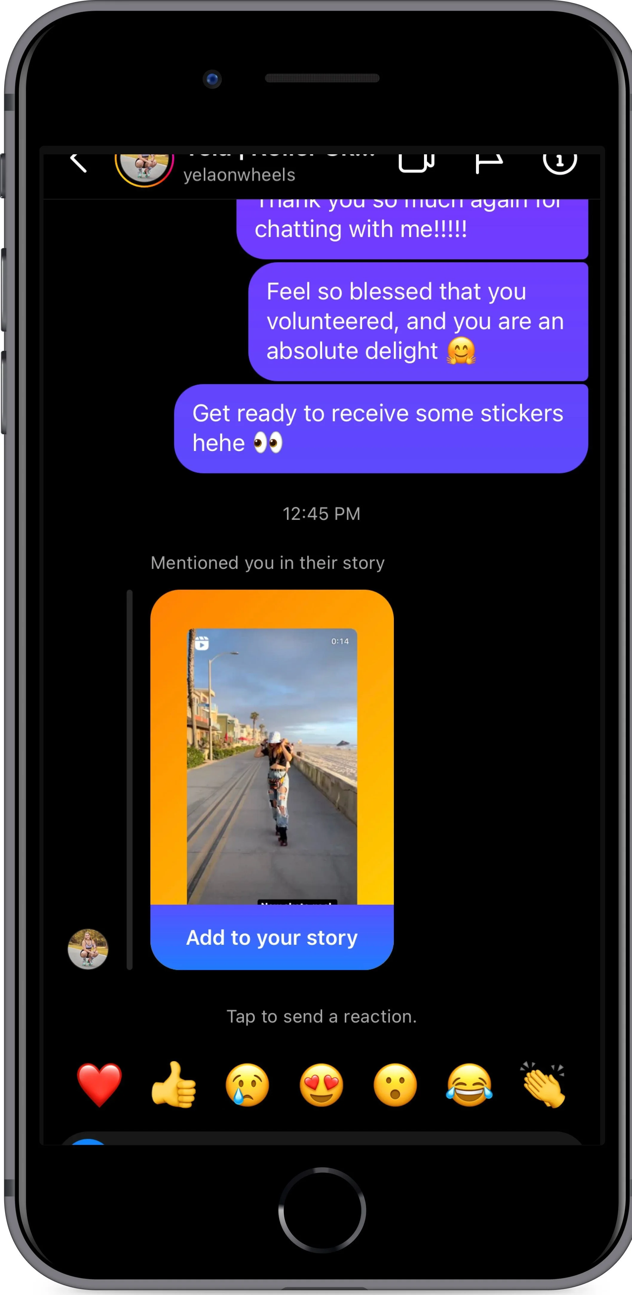
Messaging
There were many possibilities for how to notify creators and confirm payment for fans. From the discovery research, fans feel connected to creators through providing monetary support. To enhance this feeling of connection and to give creators the opportunity to recognize fans who are supporting them, I designed the notification system to come through messenger. This has similarities to how stories operate to show the creators who is re-sharing their content when they get tagged.
Test
Because the design components for Instagram are well-established, I used hifi designs to get users’ impressions of usability and desirability.
Usability test objectives
Task Usability: How would you give $10 to a creator you like?
Track time to completion
Rate the ease of the task (1-5)
Completion rate (yes/no)
Perceived value
Blockers or hesitations
A/B testing differences between 2 Support Page flows
Research outcomes
(N = 6)
What Went Well:
Ease. All participants stated that completing the task was extremely simple and straightforward. The average rating for ease of use was 4.83 out of 5.
Platform consistency. Users commented that the feature blended seamlessly into the platform and were surprised that it wasn’t already a feature.
Design. The design was overall viewed as ‘clean’, and the color-scheme and design of the message notification was well-liked by users.
Overall value. Virtually all participants could envision scenarios in which they would utilize the feature. Particularly, subsidizing smaller creators or less ‘marketable’ creators who may not get big brand endorsements was cited as a desirable use case.
What Did Not Go Well:
Discoverability. Because the ‘Support’ button has the same treatment as the email and message buttons, it gets lost in the profile if users don’t know it’s there or what they're looking for. For some users, the word ‘Support’ didn’t immediately associate to monetary support, decreasing discoverability.
Custom amounts. Multiple users inquired why custom amounts weren’t available. Although they themselves said they wouldn’t necessarily leverage that feature, they could envision scenarios in which that would be desirable.
Custom Message. From the current design, users inferred that they could enter a custom message into the form fields. Custom messages was viewed as a big value add–assurance that a creator would read a message in the inbox.
Anonymity. One user stated a desire to send amounts anonymously, and misunderstood the toggle in the form field which would allow that.
Documentation: Usability Test Planning | Usability Results
Next Steps.
During my usability interviews, a few themes came up which could create value beyond this simple Beta. Moving forward, I’d research and test custom messages, custom amounts, creator backend configuration, and feature discoverability to generate the most value for fans and creators.
Custom Messages. Two possibilities for custom messages are to either integrate message drafting within the checkout flow itself, or to have that as a separate flow after checkout. I would want to A/B test this.
Custom amounts. Designing and testing the form to allow for custom amounts from fans.
Creator configuration. Should the creator be able to write their description for ‘Support’ with details like how the money gets used or whether they guarantee a reply from messages with over a certain monetary amount? I’d want to research this.
Anonymity. Clarifying this option through an opt out toggle to ‘send anonymously’.
Feature adoption. Since discoverability was low in testing, the campaign to launch this feature would likely require collaboration with creators to highlight the feature and educate their fanbase about how to find it. This campaign would need to be developed.
What I learned
Using my discovery research, I weighed the product strategy for various patron features, considering the needs of both creators and fans.
I affirmed the value of adding a ‘Support’ feature to Instagram through usability testing. I also discovered the importance and surprising use-cases of sub-features: custom amounts and custom messages.
As I designer, I learned about the subtly of balancing the most seamless pattern for user experience with dev resources for implementing new patterns.
I also learned the importance of having the right signifier and language to describe a feature. Through consideration and testing, ‘Support’ as a term seemed like the best option, over ‘Donate’ or ‘Give’ or ‘Tip’ which all had more baggage. However, finding a different framework for this feature, like a “Priority Message”, or a different term could aid in both discoverability and implied use-cases. I more deeply appreciate terminology as an integral part of the design process through this experience.