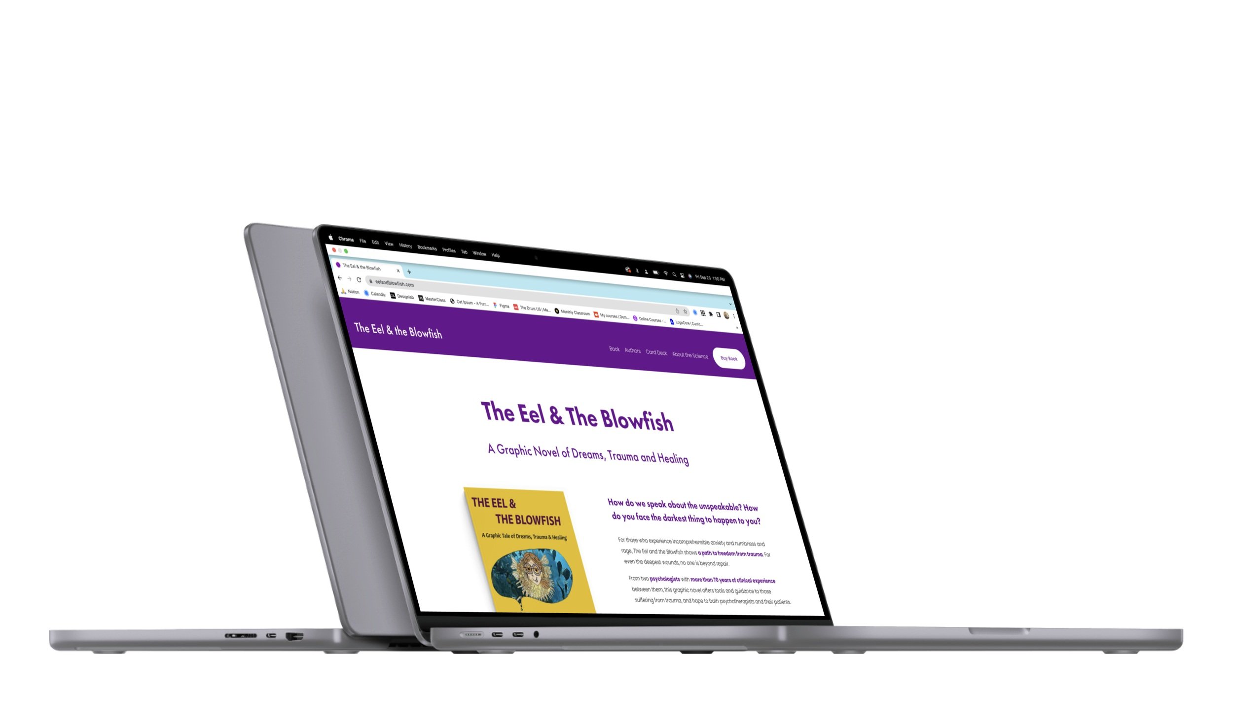
The Eel and the Blowfish
A responsive marketing site for a therapeutic graphic novel.
Project Background
The clients, two psychotherapists, approached me for a brand identity, messaging framework, and responsive site to communicate the value of The Eel & The Blowfish, a genre-bending graphic novel on trauma and healing.
Brief
Communicate making the very difficult, unapproachable subject of trauma approachable through imagination, storytelling, and dreams. Funnel traffic to the publisher’s website for purchase.
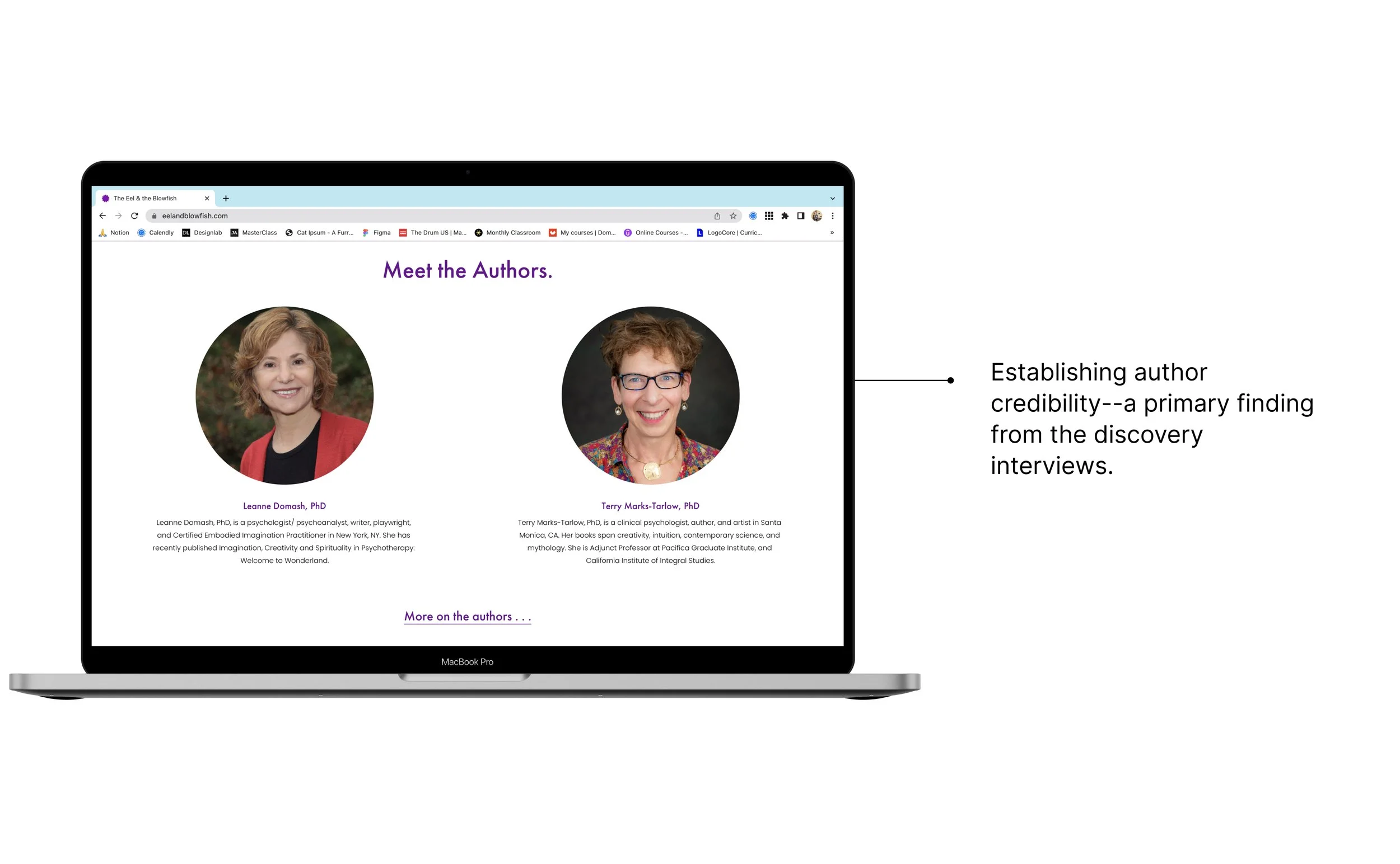
The site branding must balance the playfulness of the book and unique, but heavy source material, and build the authors’ credibility.
Time: Approximately 80 hours to complete the project.
Stack: Site upkeep must be user-friendly for the clients, who are nontechnical.
Deliverable
Fully functioning website.
My Role: Full-stack UX designer
Discover 2. Define 3. Design 4. Test
Discover
The research goal was to identify the key information, visuals, and language to entice audiences to buy the book.
These methods were selected to balance speed with useful insights.
Competitive research
I reviewed websites ranging from marketplaces like amazon to individual author sites of related book categories in healing for a general audience or graphic novels.
Discovery interviews
I interviewed psychotherapists on professional book recommendations, criteria for professional books, if and when they recommend books to patients, and how receptive to a graphic novel as a resource they are.
I interviewed lay people about self-help books, therapy, book recommendations, where they buy books, the last time they bought a book, and their receptivity to a graphic novel about healing trauma.
Contextual Inquiry
I observed both psychotherapists and lay people navigate book websites to judge the presentation of similar books and their authors.
Research Insights
Recommendations. Recommendations were consistently the biggest consideration for buying books, both for professionals and the general public. Given the time investment of reading (and ever-proliferating content competing for attention), people rely on trusted sources to guide them.
Author credibility. The who was at least as important as the what of the book for both professionals and the general public. Knowing that the author had the relevant education, expertise, and experience was unanimously key for users.
Relevant book details. There was a wide range for desired depth of info and what info each participant valued. For example, some users valued reviews highly, and others don’t bother with reviews because of their ‘subjective’ and ‘irrelevant’ quality. The right balance of enough info, but avoiding info-overload proved key. For many users, too much info meant that they spent less time on the page, while too little info led to the same result.
Messaging. There was consensus for what messaging resonated among users: a personal message of transformation, specifically highlighting the concrete techniques employed by the material, and the credentials of the authors.
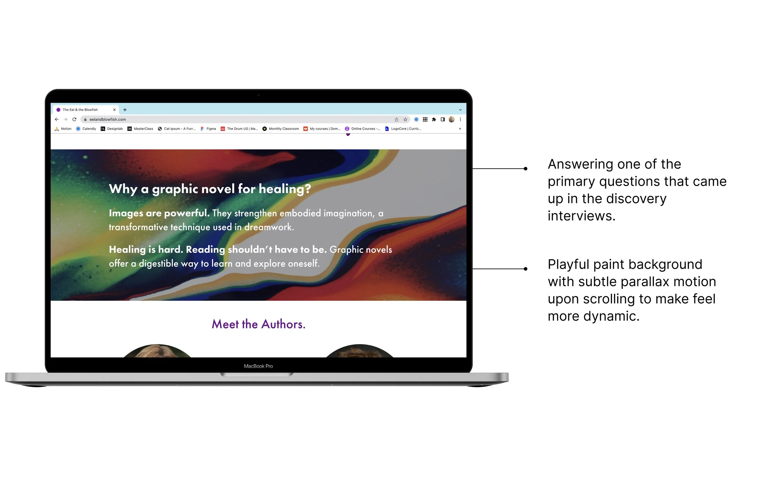
Pitching a graphic novel. Psychotherapists were pulled in by how cutting-edge using images to deliver content is. Both therapists and the general public felt positively about the digestibility of a graphic novel.
Documentation: Interview Scripts | Empathy Research | Research Debrief
Moving into the define phase, the task was to intelligently structure info to suit varying levels of user motivation, and differing weights placed on each type of info.
Readers had some integral questions that the page needed to answer:
How does this help me? Who are the authors? Why are they the ones to give me this info? Why is this a graphic novel? Will this be pleasant? Is it well-written?
Define
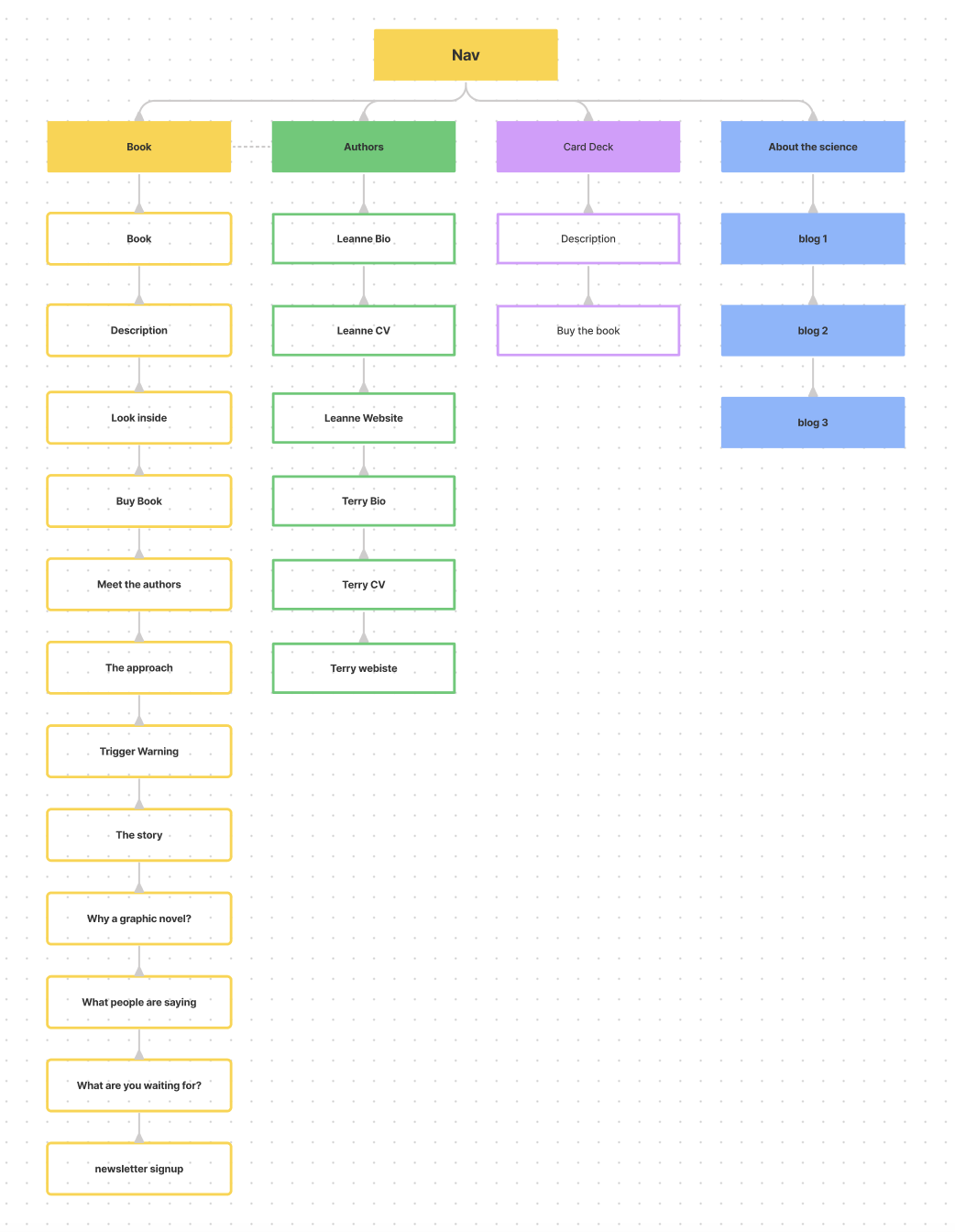
Site Map
Lofi Wireframe Sketch
Because I was using SquareSpace, I did minimal sketches to get organized, but quickly, jumped straight into using SquareSpace for a testable working prototype.
Design
Visual Identity
The challenge was balancing playful with professional.

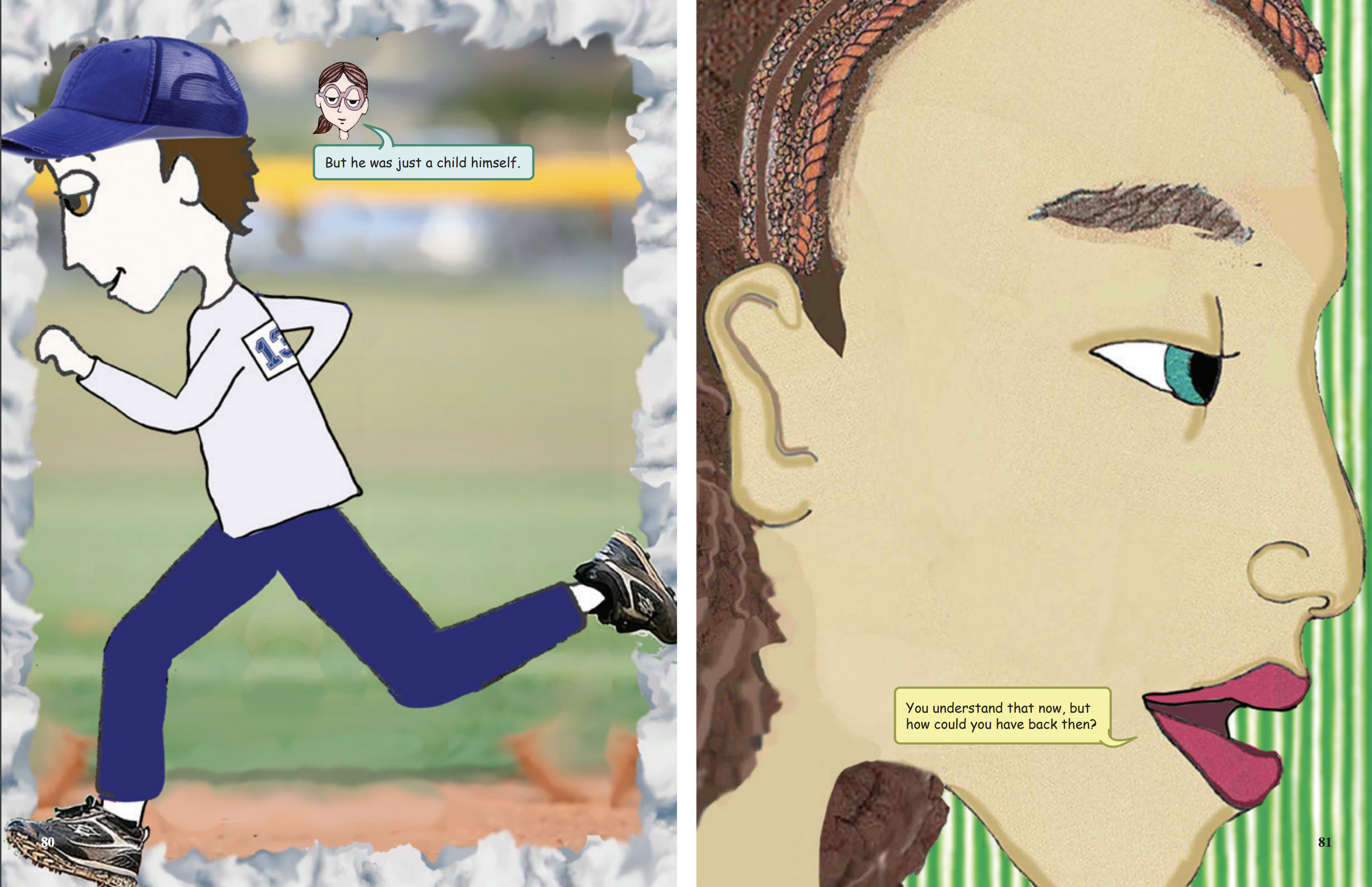
The images on the site are a blend of artwork from the book, the artist’s other illustrations, psychedelic swirls, and colorful, abstract shapes.

The ulimate style tile creates an impression that this book is for adults and is trust-worthy, despite a playful, non-traditional presentation of therapeutic protocols.
Working Prototype: Version 1
Test
Usability Test Objectives
Quality of flow for site design.
Hesitations, friction, or frustration throughout the site design.
Clarity and effectiveness of site copy.
Which excerpt for the ‘Look inside’ feature.
Research Outcomes
What Went Well:
Messaging. The messaging was extremely well received—clearly describing the source material and its value.
Visuals. The visuals were a highlight for all users.
What Did Not Go Well:
Navigation. Scrolling was identified as effortful and all users (not the most tech savvy generation) did not realize there was more content below the first page view.
Messaging and info hierarchy. The ‘Look inside’ and the ‘Buy Book’ buttons were seen as competing. Commonly, the “Why a graphic novel?” section was recommended to be higher up.
Card deck. 2 of the 3 participants felt that the bottom section was too granular. One participant was confused how the deck of cards and book relate to one another.
Documentation: Usability Test Planning | Usability Results
Iterations
Reorder content.
Add signifier that there is more content below.
Decrease amount of info for deck of cards.
Clarify the relationship between the book and the card deck.
Improve layout, typography, and info hierarchy across site.
Improved Designs


What I learned
This was an amazing opportunity to work with a real client. I learned about communicating the design process to non-designers, advocating for decisions, and working within contraints.
Additionally, this was a unique opportunity to learn more about psychotherapists and how to capture their interest.
The site is now live and has received extremely positive feedback, leading to more freelance projects with other clients.