
Mirror
Responsive e-commerce site for global clothing brand.
Mirror is a store aiming to make any type of clothing accessible to everyone. They started back in 1994. Now, they have over 400 stores in 32 countries.
Goal
Mirror is late to digital transformation, but the opportunity for online sales is huge. For their digital debut, they want
Design a responsive e-commerce website that is easy to use & allows customers to browse products, filter by size, color, style, etc.
Company logo that is modern & neutral for all types of people & styles.
New branding that is neutral, modern & fresh, clean & clear.
My role: Full-stack UX designer
Discover 2. Define 3. Design 4. Test
Problem
From my research, key user pain-points for online retail were:
Cluttered interfaces. Unpleasant & distracting experiences discouraged users to continue looking for what they wanted.
Sizing Uncertainty. No one wants to deal with online returns–this pain point was surprisingly pervasive among all users. This means the sizing absolutely has to be right the first time. If the brand is unfamiliar, this anxiety is especially salient to the user.
Solution
Through my design process, I researched, architected, tested, & iterated a responsive site that is clean, neutral, & modern, while inspiring confidence in product sizing.
Minimalist design. A spacious design minimizes cognitive load, creating a calming and pleasant overall experience. This helps reduce bounce rate and increase and product exploration.
Sizing trust. I created a set of innovative features to reduce sizing uncertainty and inspire confidence while shopping
Switch Product Model Feature
Find My Size Feature
Extensive Size Guides
Robust User Reviews
Discover
Mirror has historically been entirely brick n mortar, so in steering their digital transformation, the challenge was to build the knowledge base from the ground up of what customers look for in online experiences. The idea was to identify existing pain points and competitive opportunities for Mirror to shine in the online retail space.
I sought to capture
User motivations for shopping online, as well as how they approach the task.
How people narrow down to their specific style.
Pain points and opportunities are for optimizing online shopping experiences.
Methods
-
I selected these methods based on a balance of efficient and inexpensive data collection, as well as distilling insights for opportunities within online retail.
-
Competitive research
Competitive research is one of the most effective, low-cost ways to see how alternative services solve similar product challenges, as well as their positioning, messaging and branding strategy.
-
User interviews
User interviews, where I hear user perspectives first-hand, often provide the richest insights—one can glean full context, ask follow-up questions, hear free associations, spontaneous pain points, and unforeseen opportunities.
-
Contextual interviews
Contextual interviews, where I observe users think out loud as they navigate similar services online, provides a very low cost way to assess product strengths, weaknesses, and opportunities before any investment in building a prototype.
Competitive Analysis
-

Old Navy
Strengths
Targets budget-minded audiences.
Calls-to-action specifically catered towards budget-minded individuals.
Fun & bright brand personality
Weaknesses
Very cluttered and overwhelming presentation of information.
The uncohesive and loud color scheme contributes to this cluttered feeling.
-

Target
Strengths
Presents info in a more minimalist way that doesn’t feel overwhelming.
The site is easy to navigate, despite many brand categories.
Weaknesses
Inconsistent design across the site. Their red brand identity often clashes with the neutral-toned, dressed-down pages.
-

H&M
Strengths
Minimalist design is easy to navigate and calming.
The brand identity is easily recognizable and adaptable for multiple audiences.
Editorial feel enhances the products.
Weaknesses
Sometimes the minimalism undercuts important information for individual product pages.
Site could do more to inspire sizing confidence, especially around their reviews.
-

GAP
Strengths
Calls to action have primacy.
Colors & minimalism are calming.
More ‘cool’ editorial feel.
Weaknesses
Discount and sale calls-to-action undermine the cool editorial feel they are going for.
Site is basics first, missing more fashion forward design as well as products.
Recruiting participants
Given Mirror’s mission of making clothing accessible to everyone, I sought a demographically representative population for a full spread of possible user ages, genders, and incomes (n=4).

Research Insights
All participants wanted to find something in their individual style, easily, & at a reasonable cost. They wanted 100% confidence when ordering, so they would never have to return anything.
-
Desire to buy functional items in their individual style, with price being a concern, but a secondary consideration (100%)
Frustration surrounding narrowing to an appealing selection (100%)
-
Frustration & apprehension around sizing (100%)
Getting ‘pissed off’ when pieces don’t fit (100%)
Desire to see themselves in the clothing (100%)
Dislike for models used to make clothes look good, as opposed to being informative about fit (75%)
Desire to understand the materials used, especially for details such as texture & stretch (75%)
Strong aversion to returns (100%)
-
Strong aversion to ads (100%) and perceived data collection (50%)
Documentation: Interview Script | Empathy Research | Research Debrief | Competitive Analysis
Persona
Based on the discovery research, I chose the lead user, a millennial woman who shops both the most frequently and the most online to develop as the persona.

All participants wanted to find something in their individual style, easily, & at a reasonable cost. They wanted 100% [sizing] confidence when ordering, so they would never have to return anything.
Define
Information Architecture
The discovery research made the goal clear: for users to easily find relevant products for their body type in just a couple clicks. To accomplish this, the main nav has overarching product categories for women, men, kids, and sale.
Within each of these, there’s a shallow navigation so users can frictionlessly find the relevant products.
Sarah Winters (persona) was identified as the lead user, so while the branding is flexible enough to cater to men or those shopping for children, the site was primarily geared towards millennial women.

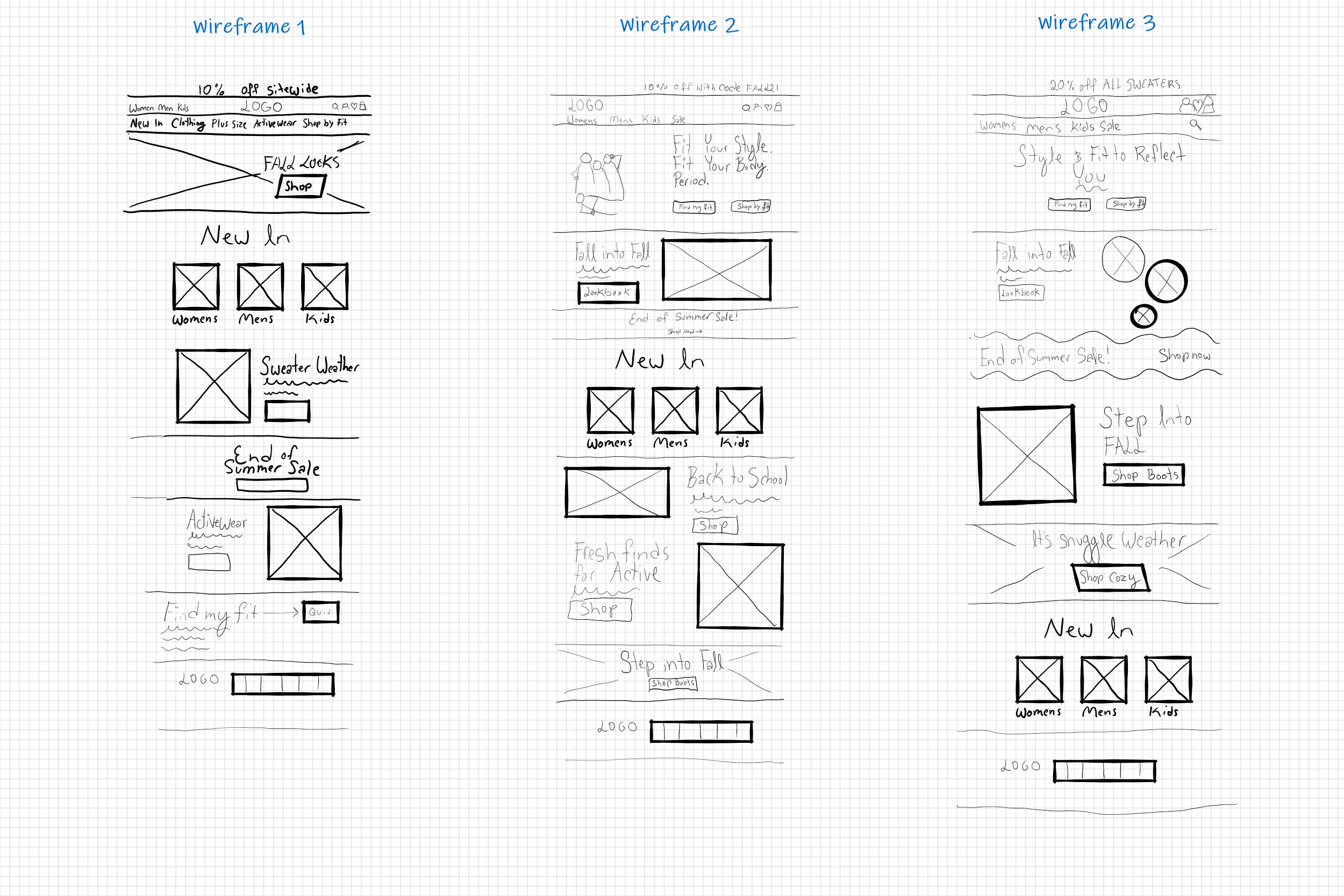
Low-Fidelity Wireframes
I came up with 3 desktop homepage layouts for Mirror. All these homepage variations are optimized for product browsing behavior, since this was a common pattern observed in the contextual interviews.
Wireframe 1 creates a useful category-specific nav bar based on Woman's, Men's, or kids. The page info highlights what's new & key product categories.
Since product sizing was such a key issue, Wireframe 2 has minimalist nav & focuses on the 'style for everybody' value prop by highlighting the shop by fit feature. It features new products & key categories. Wireframe 3 is a variation of 2.
User Task
Using Whimsical, I created this task flow to capture the task of buying a pair of wide-leg white denim pants with a tall fit for the Sarah persona. This task and the constituent steps stemmed directly from the user interviews.

With the information architecture and task flow in place, I moved into designing the key screens to complete the shopping experience end to end.
Design
Responsive Mid-Fidelity Wireframes
Based on the task and user flows, I identified the 5 most key experiences for shopping as the
homepage
category page
product page
size help
shopping bag page
I leveraged elements of all the sketches and proceeded with the sizing for everyone value prop to test for the hero and primary CTA.


Developing the Mirror brand.
Clean, clear, modern, & neutral.
Mood Board
I used Pinterest to find minimalist, airy designs that could be leveraged for multiple audiences.

Logo Design
I created multiple logo options, playing with a reflection motif to hit the brand design brief.
I ultimately landed on the bottom logo for its symmetry, simplicity, and clarity.

Style Guide
In addition to being clean, neutral, fresh, & modern, I aimed to make the brand to feel calming & optimistic. Leveraging design elements from my mood board such as ample white space, large images, and combining neutral and pastel tones, I created this style guide. The color palette was inspired by a lazy day by a lake.

UI Components
Based on the style guide, I created the UI components in Figma, focusing on a minimalist feel.
Responsive UI Design
With the lofi wireframes and style guides fleshed out, I populated the wireframe designs with colors, stylized buttons, nav, and image assets to begin moving towards a testable prototype.

Deliver
Through the course of the discovery research, it became clear that two big opportunities in this space were for an easy-to-navigate, uncluttered design, as well for inspiring full confidence when it comes to ordering the right size.
To deliver on that, I created a number of features:
Features
-
![]()
Circle design to evoke a mirror and a line to play with a subtle reflection motif
-
![]()
Hierarchical main menu for shallow navigation within each department
-
![]()
Sorting and filtering options which slide out upon click. for minimalist aesthetic without sacrificing functionality
-
![]()
Switch model feature to demonstrate multiple product sizes
-
![]()
'Find my size' form to eliminate uncertainty around which size is the best match
-
![]()
Review section with anonymous, extensive details for user sizing
-
![]()
Product details, including materials, model sizing, and style notes. A tab for delivery options


With a number of new features in place, it was time to test my hypothesis around minimalism and sizing confidence, as well as ensure that the site was truly navigable.
Usability Test Objectives
Test overall quality of flow for site design.
Test how fit and product quality are assessed for a specific product.
Test ease and efficiency of purchase.
Find any points of hesitation, friction, or frustration throughout the site design.

Recruiting
Half the participants were close to the lead user ‘Sarah Winters’, & other half cover both gender & age demographics; (n=4):

Documentation: Test Planning | Test Results | Affinity Map
Research Outcomes
Sizing Confidence
It’s key to build user trust through clear and detailed information on all aspects of the garments, model sizing, and reviewer sizing. This is especially important for an inclusive business strategy, where a notable percentage of users may deviate from the ‘norm’.
Review Comprehensibility
While this section works reasonably well as is, this module can be cleaned up to make it simpler and more useful at a glance. Reviews are the backbone of online sales, so this high-impact area is well worth the time and effort to optimize for comprehensibility, utility, & ease.
-
100% easily navigated to ‘Sweaters & Cardigans’ section of the site
75% used main nav to shop by product
25% used the ‘Women’s’ category from the homepage, then the side nav to arrive at ‘Sweaters & Cardigans’
-
75% desired more specific measurement info for product dimensions.
50% found the size guide very helpful. 50% found it moderately helpful.
100% found the ‘Switch Model’ feature seemed useful.
However just 50% explored this feature organically; the others required prompting.
100% wanted more prominent sizing info for the product models.
50% also stated a desire to know the model measurements.
-
100% found the review section to be relatively straightforward.
100% understood average stars & average ‘True-to-size’ assessments.
100% understood ‘All Reviews’ and ‘Images’ tabs.
100% understood the majority of individual reviews & accompanying images and sizes. However, a few points of confusion were pointed out:
One user pointed out that ‘Length’ as a ‘True-to-size’ parameter for a sweater was ambiguous (could refer to either neck to waist length or sleeve length).
One user was thrown by the anonymized names.
One user wanted to see the individual product ratings.
One user pointed out that the ‘Images’ tab could be clarified to ‘With Images’.
Iterating.
Product & body measurement size chart
The usability yielded numerous insights for how to further improve the design. Most notably:
Size guide with product measurements
More default-open measurement details for reviewers
More model size measurements and made more prominent
Remove average ‘length’ rating from reviews
Reviews default-open
Change copy of ‘Image’ tab to ‘With Image” in reviews
End Deliverable


Limitations & Next Steps
While this project yielded rich insights into the e-commerce space, there are a number of areas for future improvement:
Design, prototype & test the remaining screens for the site.
Further refine brand voice with more tailored site content.
More extensive usability testing.
Test & optimize for globalization.